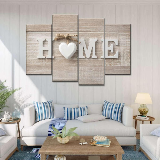
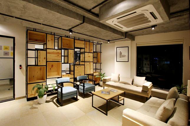
Choosing the right color scheme for your decor may be quite handy, especially when you have no idea of the available combinations. This guide will be using wall art ideas and the 60-30-10 rule to help you create the most astonishing design ever.
What is the 60-30-10 Rule?
The 60-30-10 decorating rule is a rule that helps people to choose the best color scheme for their interior designs. There are several naturals, subtle, bold, and bright shades. As much as you can choose any of them, a 60-30-10 rule will help you determine which one is best applicable to meet your design needs.
The major point of the rule is to ensure you use a 60% dominant color, 30% secondary color, and 10% accent shade. With this, you can achieve a perfect color tone without going all over the palette.
The Dominant Color
The dominant colors occupy the major section of the room and should be applied to a visible wall. Hence, apply it to the side of the wall that gets visitors’ attention upon entering your room.
The Secondary Color
The secondary color should rather complement the dominant color and not overshadow it. It would help if you portrayed it in other elements in your home. This may include the chairs, area rugs, curtains, or couch. More so, it should blend properly with the dominant color.
The Accent Shade
The accent shade may seem less important because it covers only 10% space of the room. This is not true because each color shade needs to be prevented from creating the perfect combo and tone you want. You can get an accent shade from the decorations and accessories of your room. This may include the pendant lamp, the small rug at the study arena, or the candles.
Your wall arts can also serve as the accent shade of the room.

How to Implement the Best 60-30-10 Idea
Make sure you choose the right colors to represent each shade. Often, white will serve best as the dominant color, brown as the secondary color, and green as the accent shade. These are just colors that people mostly use. You do not need to choose from any of them if the colors do not interest you.
On the other hand, individuals who love to get sophisticated and achieve a bold look can choose bolder shades. This will imply greige as the dominant, black as the secondary, and gold as the accent shade.
You need to be creative when choosing and combining colors. If you only have a favorite color and want to try it all through, you can go with a monochrome design. It can still be subtle and stylish at the same time.
Another way to go about the monochrome design is the use white and black as the major shades and add a splash of an accent color. For traditional decor, you can achieve an enticing decor with a rusty look. Hence, rules should only make your interior decor better and not restrict your creative ability.

Wrapping Up
Focus the three forms of color shades in a pronounced area such as the entryway to get the best result. Although you will want to appease your audience, first consider the colors in your best interest. What shades suit your best? Kindly implement them in your interior designs.


